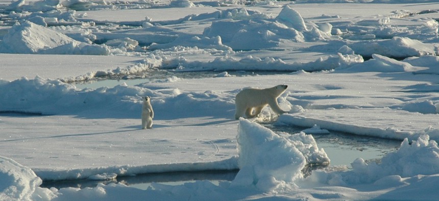
A polar bear and her cub walk along ice floes in the Arctic Circle in 2005. NOAA file photo
The White House Wants a Good Map of the Arctic
Want to see how glaciers retreat? There’s a map for that.
Armed with a selfie stick, President Obama went to Alaska this week in part to bring new visual angles to his appeal to save the Arctic from climate change. And now he’s adding a high-tech map to that effort.
As part of a slew of climate-change initiatives unveiled during the Alaska trip, the White House announced a plan to create the first high-resolution, satellite-based elevation map of the Arctic. When completed (estimated for sometime in 2017), the topographic map will be publicly available, offering scientists and the public a real-time look at how the region is shifting due to climate change.
Right now, there’s no comprehensive, uniform map of the Arctic at this level—it’s a patchwork of data that’s inconsistent or, in some areas, incomplete. Because vast areas of the Arctic are so remote, it’s been nearly impossible to create the more advanced topographical maps from plane flyovers, and in some of the more isolated places, the best data comes from ground surveying.
To create the new maps, satellite data will be used to create a comprehensive map of the Arctic with a resolution of between 2 and 8 meters, fine enough to see individual buildings or subtle shifts in the coastline.
“We can see changes with the permafrost, we can clearly see the retreat of glaciers,” said Paul Morin, director of the Polar Geospatial Center, a partnership between the University of Minnesota and the National Science Foundation. “We’ve got a tool that can look at the Columbia Glacier [a fast-moving glacier in Prince William Sound] and you can not only see it retreating it horizontally, you can see it drop.”
Data from the ArcticDEM (Digital Elevation Models) project will be open to the public and will be loaded into Google Earth’s engine program. That will make it easier for scientists to track the changes in the landscape over time, especially as warming temperatures accelerate changes in the coastline and physical features.
The project is a partnership between the NSF, the National Geospatial-Intelligence Agency, and Cornell and Ohio State Universities, using the NSF’s supercomputers to process existing satellite data to create the map. The Interior Department and U.S. Geological Survey will also fly through the Alaskan arctic with new sensors to create an even finer map as part of the program.
But researchers said the new project won’t just be about comparing the landscape over time—it can offer valuable information that simply hasn’t been collected in the Arctic regions. The map will include layers with data on Arctic currents, oil and gas reserves, and Arctic routes, updated to account for the rapid changes in the region, which is feeling the brunt of climate change.
That means that firefighters battling Alaskan wildfires—which are melting the layers of ground known as permafrost because it’s not supposed to get above freezing—could have more accurate landscape data. The maps could show transportation routes across land or through Arctic waters.
Coastal villagers, some of whom are already being forced to relocate their homes because of sea-level rise, could use the more accurate imaging to prepare for climate change. For example, this image shows the definition for Point Hope, Alaska, a village of less than 700 people where every house is within a few vertical feet of the current sea level.
)
A Digital Elevation Model of Point Hope, Alaska. POLAR GEOSPATIAL CENTER, OHIO STATE UNIVERSITY, CORNELL UNIVERSITY, DIGITALGLOBE INC.
“The Arctic is warming faster than anywhere else, but we haven’t had this kind of holistic method of looking at everything all at once in this way,” said Michael Willis, a research associate at Cornell University who has used elevation mapping to study ice sheets in the Arctic. “Anyone, anywhere can be looking at anything related to topography and they’ll have a phenomenal base map to compare it to.”
It’s similar to a hyperdetailed 3D mapping project of the United States by USGS, which has also been funded under the umbrella of climate change. Both projects are meant to use the most advanced cartography to radically improve scientists’ understanding of how climate change is affecting the landscape and how its impacts could play out. The result, said Morin, is that research that was previously unthinkable could soon be available with the click of a mouse.
“With permafrost, you used to fly an airplane or literally have someone walk the ground,” Morin said. “We’re measuring things in an efficient and cost-effective way that were once impossible.
NEXT STORY: Wonder What’s Hidden in Your Personnel File?


