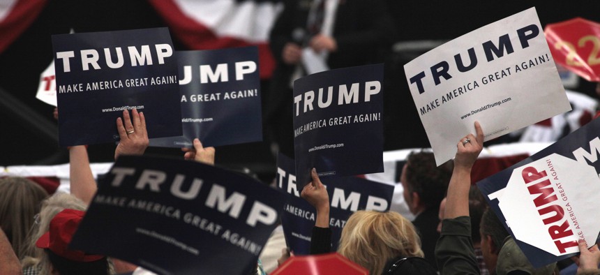
Flickr user Gage Skidmore
The Statistical Models Vying to Define Donald Trump
Scores of mathematical analysts have attempted to discover the secret to the candidate’s success. No one has gotten it yet.
Donald Trump’s success seems inexorable, inexplicable, and immune to punditry. Of course, that hasn’t stopped pundits from trying. By now, the marketplace of ideas is so crowded with why-Trump-is-winning theories that the line to return expired opinions stretches longer than the wait at an Arizona caucus site.
But as more states cast ballots, political analysts are getting actual data—not just opinion poll results—on what voters want. Granted, they don’t know whatindividual voters think; most states aggregate results at the county level and up. But by using publicly available demographic data and a bit of computer modeling, analysts can begin to link a county’s vote to the makeup of the people who live there. Predictions about what voters care about can be backed up with data, not theory.
Or at least that’s the idea. In practice, the results have been much weirder.
Earlier in March, The Washington Post’s Jeff Guo ran an analysis of Super Tuesday vote returns and found that Trump fared unusually well in counties where older white residents were more likely to die in middle age, a conclusion he couldn’t conclusively explain. A little over a week later, two reporters at The New York Times found their own statistical quirk: Counties with a higher proportion of residents describing their ancestry as “American” on Census forms (as opposed to “Irish” or “Dutch”) were more likely to vote for Trump. That correlation was stronger than other things you’d expect, such as the percentage of “old-economy” jobs or the proportion of evangelical Christians.
Sometimes, the results have been downright confounding. Evan Soltas, a Princeton student and blogger, found that the vote for Trump in Michigan was actually negatively correlated to the loss of manufacturing jobs—meaning counties that saw outsourcing and layoffs were less likely to vote for him. “I remain quite surprised that the protectionist-backlash explanation isn’t apparent in the data,” Soltas wrote. “But it’s not.”
There are several possibilities here. Analysts either need additional data points—more state elections and more county results, which will yield a wider pool of information—or they need better theories. It’s possible reporters haven’t hit on the right combination of variables to accurately model Trump’s rise. Should they be including median salaries in a given county? Hours worked? The number of Cracker Barrels along state highways? This is the allure and frustration of data science, which rewards the endless search for a new slice of the data to explain an outcome. (It’s also the secret sauce behind Kaggle.com, a data-science competition website that pits users against each other to develop the best predictive algorithm. There’s always the sense that if you add just one more variable to your equation, your predictions could rise to the top.)
With Soltas’s numbers in mind, I took my own shot at modeling Trump, focusing on industrial Midwest voters living in Ohio and Michigan. My theory: Given Trump’s success in the Appalachian counties of Ohio, perhaps there is a distinctive split in his support between communities that lost their industrial base long ago and counties who have faced more recent hardship.
Pursuing this, I pulled manufacturing workforce numbers for each of the counties, finding the percentages of jobs lost over three time periods:
● between 1975 and 1993, when increased competition from Japan and elsewhere sent jobs overseas;
● between 1993 and 2007, after NAFTA took effect and Mexican factories picked up a greater load of U.S. manufacturing;
● and between 2007 and 2014, amid the Great Recession and its aftermath.
(See the raw data and code methodology here.)
The results? Controlling for race and education, there appears to be little correlation between a county’s long-ago job losses and Trump support. The New York billionaire did see a modest bump among communities that saw losses after 2007, but the effect was small—and dwarfed by his advantage among people who didn’t attend college, a connection strongly supported by the data.
The Democrats were more interesting. Bernie Sanders, the champion of equality, actually performed worse among communities that saw manufacturing-job losses, both through the NAFTA era and more recently. Hillary Clinton scooped those folks up, though she didn’t do as well with college graduates and whites. Clinton also won out over communities where incomes are unequal. For every hundredth of a point on the Gini scale, which ranks communities somewhere between zero (perfect equality) and one (perfect inequality), Clinton gained more than a percentage point in support. (Trump, for the record, was less popular in unequal counties.) This could reflect Clinton’s apparent advantage in Rust Belt cities, where manufacturing fizzled decades ago and income remains stratified by neighborhood. And it takes a knock at the idea that Trump’s support has deep roots in any protectionist movement.
But this model, like any published during this cycle, is limited. The trick is taking the insights seriously without taking them as gospel—and making sure to evaluate the assumptions their creators made.
Every time a county is called for a candidate, it’s another data point on the grand graph of the United States. Soon—my guess is November 8, 2016—it’ll be enough to call this thing.
(Image via Flickr user Gage Skidmore)


